Showing posts with label Digital Imaging Class. Show all posts

Thursday, December 15, 2011

Through the Window


Project 2C: Peep Hole
Going back to a more generalist concept; my last project is a look into the world with lens of fantasy. 
We have a woman in a gown with a spiral of leaves surrounding her. She is connected to vines crawling behind her and around her. She produces an aura of blue and yellow as she stares at the city. (In this case; Tokyo). The project is quite self explanatory. The woman represents nature and purity, and she is distressed at the sight of the walkway of skyscrapers, office buildings and shopping structures. She brings with her her "security blanket"; her bits of nature. They surround her and she tries to fix the world with the vines. The "window" is created to give the audience more perspective. To make it seem like we are peeking into her subconscious. The color and texture is supposed to represent cement -- she is held in. The cement is still lightly dripping across the scene, signifying that she is trapped and that change isn't near.

Monday, December 12, 2011

City Skyline


Project 2A: Crystal Ball
For my first project I decided to try to convey a message through my artwork about how our society is obsessed with building new structures, and is thus destroying the environment. I had a couple of ideas in mind, but settled with a spherical shape. The sphere represents a crystal ball (like the ones oracles and fortune tellers use) which can tell the future and the past of a scenario. In this case, the scenario is a city skyline at night with a reflection in the water. The reflection in the water has been transformed into trees - reminding the population of the potential forest that could have been growing there in place of the skyscrapers. I used various colors to change the trees overall look so as to make it look like a real reflection from the buildings. The entire ball is set in a black abyss, signifying the lack of change we are presenting to the situation. It's a free-floating problem, with hardly any steps to changing it for the better.

Tuesday, December 6, 2011

Desertification Disintegrates Animals


WWF
In an effort to educate the mass public about desertification, the degradation of land in drylands, Mardid-based agency Contrapunto BBDO created this series of eye-catching ads for the World Wildlife Fund. An elephant, leopard and parrot are seen deteriorating into clouds of dust, reminiscent of the dried up floors in the eroded landscapes.

According to WWF and Wikipedia, desertification destroys 6.000 species every year and is caused by a variety of factors, such as climate change and human activities, desertification is one of the most significant global environmental problems.

                I really like these ads for WWF.  Amazing combination of fantastic photography and talented Photoshop skills.  I love that WWF usually makes a series for their advertisements - a handful of posters revolving around the same theme, using the same techniques.  Another thing I love is the use of light in each of these pieces.  The rays of light seem to be burning and even hurting the animals.  The dust looks realistic and powerful.   The designer also did a great job in slowly fading into the dust instead of having a harsh change between animal to dust.  It slowly crumbles away... 


Monday, December 5, 2011

What number are you?


Part one of my final project for my
SCRIPPS ART 141: Digital Imaging Class

Project 2A: Static Identity
This project is going in a slightly different direction - more towards personal and individual issues rather than societal and environmental problems.  The quote taken from the prompt is pinpointing my main point.  People have several identities in the world now.  Their physical, emotional, and cyber ones are just a few examples.  You can be whomever you want to be online, and that creates an alternate personality for many people.  There are people who live a second life through an avatar on online sites.  On top of this, once you've created an avatar or a social networking site, you are completely vulnerable to being hacked.  People can steal identities and create havoc amongst people's lives.  The TV at the back signifies the static of the cyberspace we live in.  It is not stable, it is hard to understand, and it's all blurred into one big bunch.  I used children for the face because they are the new generation.  Children are growing up on video games and technology, hardly writing and reading.  They will grow up to have multiple personalities as well.  Hopefully none of us, or them, will lose sight of who we are, and what number we are in the world. 

Saturday, December 3, 2011

Still Hapenning at Pomona...

 Part 2: Helene Winer at Pomona


                        Part 2 of "It Happened at Pomona..." was definitely a disappointment after part 1, but that was to be expected.  Still it had its ups and downs.  My main problem was simply the level of abstractness the exhibition had to offer.  When it comes to art, I appreciate literal pieces, and if not so then the abstract concepts have to be explained or at the very least aesthetically pleasing.  So in this exhibition, my favorites were the aesthetically pleasing ones, or the "interesting to think about" ones.  You first walk into the room and I immediately smelled wood.  (Photo above)  Jack Goldstein's sculptures of 9 ft tall blocks of wood with no apparent stabilizing structures around it.  I had the hugest urge to push it over - but obviously I contained that.   It was just powerful.  Strong.  Solid.  I'm not sure what the meaning behind it was, but it was definitely capturing.  In the same room were videos of random acts (people lifting weights, dead geese doing calligraphy, a naked man lying on a floor... I don't even... anyway) and I couldn't take my eyes off these sculptures.


                               Then I saw this canvas (Photo above) and was immediately absorbed.  The photo does not do it justice.  It was a huge canvas that covered the entire wall, but it seemed to be made out of plastic.  The light shined on the particles used to "paint" on it, and gave it a shimmer.  Again I have no idea what it was representing -- even after reading the blurb -- but it was still cool to look at.  And also again, I had the hugest urge to touch it -- but I abstained.  It was just a spectacle.  Something amazing and large-scale to enjoy.  It was fantastic to be honest.


                        I walk into the further room (RIP blue glowing room) and see the set - the patio - and immediately shake my head.  Again.  I just don't understand.  I read the blurb, it was ... interesting.  And very specific.  Just strange.  Then I finally noticed the tiny TV by the wall.  It was a video of the artist in distress, shedding tears and showing sadness on camera.  The piece was entitled "I'm to Sad to Tell you."  Just the title alone hit my heart.  Watching someone let go of all their guards and being vulnerable on film is truly a magnificent thing.  He was so raw, so intense -- yet silent.  Having the film silent was such a crucial part to the piece.  I was captivated so much that I sat there and watched it replay 2 or 3 times.  I feel that everyone could relate to the artist in the video at some point in their life.  So he successfully managed to grab deep into everyone's heart by letting himself be vulnerable.  I read the blurb on the artist and was shocked to see that he went on an expedition for his last art piece and got lost at sea -- they declared him dead.  Then looking back to the video was even harder.   It makes you want to know what he's thinking about.  Why he would do this.  And what you can possibly do to help. 


Saturday, November 26, 2011

Project 1

My first two projects from my Digital Imaging Class at Scripps College.
The project was to find a concept and create a photoshop project from scratch.

A remake of my Highschool Painting on Photoshop.

Sunday, November 13, 2011

It Happened At Pomona...

Part 1:  Hal Glicksman at Pomona


                   I went to the Pomona Art museum quite a few times over the course of the semester.  Different from all the other exhibitions, this one was open 24/7 which posed an interesting alternative.  Never have I ever been to a single exhibition this many times -- and during the strangest hours...  But it was definitely worth it.  There were some amazing installations in the building.  When you first walk in, my favorite pieces of the first room were immediately to the left.  There were two shattered glass sculptures which were both perfect and destroyed at the same time.  You move along the rooms and run into the work above.  Imagine a huge white box on one side of the wall with huge circular ....things?.  It's almost impossible to grasp on first glance.  You have to keep staring at it to fully understand how it works... It's so serene and complex.


                    Way further into the exhibition there is a small hallway where you would not expect to walk.  There seems to be nothing waiting for you at the end.  Until you see a small opening in the wall, a small glass box/window where you can peep into a secret room.  (Photo above)  Although the photo shows a very orange glow, the room was more pink than orange.  The balloons on the ceiling were reflected on the mirrored floor, creating an endless abyss.  The way it was presented -- looking through a window -- was also very new.  I would spend quite a lot of time with my head in the window box, just zoning out and trying to imagine what it would be like to be in that room.


                       And finally, the highlight of the exhibition, the blue room.  (Photo above)  This room was the most amazing, serene, surreal, epic, trippy room that I've ever been in.  You walk through a dark hallway / space in order to turn the corner into this vast space.  The sharp oval room has a blue glow with white walls.  I was not aware that you aren't supposed to touch the walls, so I know that they feel like tights material.  As in stockings.  White stockings all across both sides.  Very soft.  The ceiling is just black, as is the carpeted floor.  I spent hours in here just lying down staring at the space around me.  I've never been so upset that an exhibition closed....  You could do some of your best thinking in this room.  At 3am.  On a Thursday.  You get the idea.  All in all I really liked the entire exhibition as an aesthetically pleasing experience.  #Win

Friday, October 21, 2011

SPRITE Drake: The Spark Commercial


http://Viatd.TV - Fresh Video Advertising and Commercial

Agency: Bartle Bogle Hegarty, New York
Chief Creative Officer: Kevin Roddy
Creative Director: Amee Shah & Matt Ian
Art Director: Erik Holmdahl
Copywriter: Beth Ryan
Head Of Broadcast: Lisa Setten
Producer: Jennifer Moore

Thursday, October 20, 2011

Advertising Now

         We talked about efficient advertising in class today.  Creating useful and classy websites, business cards, and resumes etc.  The standard for design in the corporate world is very high now, especially with the fact that almost anyone who owns a company has the means to create a good design.  If they don't the audience can only assume they are lacking, lazy and not sufficient.  For instance, the last time you looked for something online --> did the website alter your view on the product?  It did for me.

         I went to the hospital for my bum knee (Dancer-girl-problems) a few weeks ago, and to find the best hospital, I browsed through a couple of websites of hospitals near me.  I found two or three.  And I immediately decided on one.  The other two websites were bland, unofficial, and confusing.  As a result, I felt that their services might be the same way.  Any child could make a good website now, what's stopping a hospital from having one??

         Here are some photos of great business cards -- some sent to me from my mum.  Now these people know how to advertise their work!


------------------------------------------------


------------------------------------------------


Saturday, October 1, 2011

Serene Beach

Isac Goulart

I don't know if Isac uses Photoshop or not, but these photos are fantastic! The colors, the shadows and the silhouettes are all perfectly balanced.  Everything seems so natural, but also very put together.  They're obviously shots that have been thought out, but it seems like you're staring into just a normal day of these people's lives.  Also the beaches are just absolutely beautiful.  Very serene.
Visit his website and check out "a Coca-Cola Dream" taken in Miami, Florida. It's definitely one of my favorites.


Thursday, September 22, 2011

DELICATE BOUNDARIES


By Chris Sugru
"Delicate Boundaries is an interactive installation where human touch can dissolve the barrier of the computer screen. Using the body as a means of exchange, the system explores the subtle boundaries that exist between foreign systems and what it might mean to cross them. Lifelike digital animations swarm out of their virtual confinement onto the skin of a hand or arm when it makes contact with a computer screen creating an imaginative world where our bodies are a landscape for digital life to explore."

              This is one of the craziest things I've seen in quite a while.  (After the virtual keyboard -VKB-, which should be interesting)  In one of the recent readings for this class we read about new technology and how it changes art -- for instance 3D printing.  **see Robert Lazzarini** The idea of breaking down the fourth wall and being interactive with the screen is crazy.  I'm not sure how it's set up exactly, to be interactive whilst being in our personal space, but it's cool nevertheless. The virtual keyboard has the same sort of feel - the idea of being interactive without a physical matter that you are using.  Lasers, projections, and other forms of technology are coming into our "physical" world and confusing the hell out of me.  How does this work?  Anyone?? ANYONE?

Tuesday, September 20, 2011

Aloha~


Assignment Number 2
To take the above images and create a vacation-like poster for Hawaii.
Again we were taken through it step by step by the professor (whom I actually like) and thus there wasn't a lot of problems.  Quick, pain-free, and simple.

第二の宿題が出ました。上の写真を使ってハワイのポスターを作る事。
また前と同じようにクラスのみんなと先生としゃべりながら作ったのでとても簡単でした。。。早く自分のものを作りたい! 

Friday, September 16, 2011

Conversation Map

Warren Neidich is an American artist / photographer.  I first came across him whilst reading for my Digital Imaging class.  (Digital Art Second Edition: Christiane Paul)  At first glance these works look like abstract paintings made with paint or pen.  Could even be considered computer-generated randomized drawings.  But what they actually are is quite surprising.  Neidich attached LED lights to people who speak sign-language and had them conduct a conversation.  He then photographed the movement and placed them together --> creating a conversation map.

I absolutely love these two works of art.  To me, they look like perfectly composed pieces of work - a bit calmer than usual abstract art.  But to know that the photo is a representation of an actual conversation just makes it that much deeper and fascinating.  I'm also obsessed with the use of color in the works --> they seem to clash and mesh perfectly with one another.  The quality of the copy is quite appallingly terrible, but enjoy!

Conversation Map
(I worked on my film today.  Are you dating someone now?) 2002
Conversation Map
(I am in love with him, Kevin Spacey) 2002

Tuesday, September 13, 2011

Sally's Seashells


And I'm back with my homework... 
Art 141 Scripps: Digital Imaging
 As you can probably presume from the photos, my assignment was to grab the several shells from the upper image and 'place' them on a plate.  I don't have much to say about this assignment... It was simple and quick.  I had fun arranging the shadows in different ways to make sure it looked realistic, but other then that it was a quick piece of work.

やっと学校が始まってからの最初の宿題が出されました。上の写真からいろいろの貝を切ったりして新しいお皿の上におく事。意外と簡単ですぐに終わらせてつまらなかった。。。マア〜マア〜!まだ始めたばかりだし。

Monday, September 12, 2011

Shadow dance


An excerpt from a dance performance "True"
Direction and LED Design:Takayuki Fujimoto
Sound design+programing and LED programming: Daito Manabe
Dancer: Tsuyoshi Shirai and Takao Kawaguchi

                One of the most amazing dances I've ever seen, especially coupled with light and shadow.  I can't imagine how long it took them to choreograph the dance, moving around the shadow and combining the two dancers' shadows together.  I love how the movement of the light is syncopated and not smooth -- making it seem like a series of photos or something.  The movement itself is kept simple, which is good, but the amount they both spin is enough for a person to go mad...  I also saw glimpses of written word with lights in the back, I think that gave it the extra umph.  I would love to watch the entire performance one day.

Sunday, September 11, 2011

Doll Face


"A machine with a doll face mimics images on television screen in search of a satisfactory visage. Doll Face presents a visual account of desires misplaced and identities fractured by our technological extension into the future."

Andrew Huang is a God, obviously.
Brilliant short film, hard to decipher between what is made via computer graphics, and what is made of real life...  Sends a great message of how the youth nowadays are never satisfied with themselves.  The fact that they try to copy everything they see on the telly.  And how our technology is just increasing in order to "help" us achieve the beauty we want.  But one day it'll just break us, and then what will we have?  The graphics are so well done!  Fluid and natural... yet eerie as hell.

Wednesday, September 7, 2011

Digital Art Websites

Digital Imaging Class
My Digital Imaging Class's personal website.  See here for everyone's blogs, and links to cool websites having to do with photography, graphics, and anything art related.

Bored Panda
As we all know, I am completely obsessed with this site.
Filled with random links from the internet -- art, photography, videos, animations, anything!
Some beautiful, some funny -- anything you can think of really.
A constant source of entertainment.
Warning: if you have homework due tonight or the next night, do NOT click this site!!


Vector Art: Best things in life are Free 
I just recently found this site, but it looks to be super helpful with my new Digital imaging class.
It has tips and cheats for all the programs, as well as new info on the digital world.
"Free Vector offers a huge collection of graphic resources for graphic designers, illustrators and web developers."  And so it does.  I definitely recommend this site to everyone.


Scott Kelby
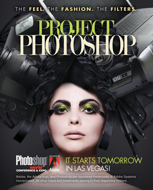
"Editor and Publisher of Photoshop User Magazine, Editor-in-Chief of Layers Magazine; training director and instructor for the Adobe Photoshop Seminar Tour, President National Association of Photoshop Professionals (NAPP), CEO of Kelby Media Group, author of a string of bestselling technology books. Conference Technical Chair for the Photoshop World Conference & Expo, author of numerous Photoshop training DVDs and online courses, and co-host of PhotoshopTV, and D-Town TV. 10 jobs, little sleep."
Basically he's just a badass.  He has amazing work, this is his own site, his own works.
He blogs about things he likes, tips, and different tidbits of life.


 Lines and Colors
"Lines and Colors is a blog about drawing, sketching, painting, comics, cartoons, webcomics, illustration, digital art, concept art, gallery art, artist tools and techniques, motion graphics, animation, sci-fi and fantasy illustration, paleo art, storyboards, matte painting, 3d graphics and anything else I find visually interesting."
Like all the other websites this is one filled with random goodies for me to browse through.  Some amazing art work, as well as new technology that I find fascinating.  The writer of the blog has similar taste to me - so I find everything he/she blogs about pretty damn cool.  Just browse through his/her site and relax~